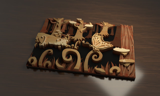
Project 2 - Render
Finding the right materials to use for rending the object fairly hard. I found some nice materials online that had imperfections, but I wasn't able to edit them as much as the basic materials in rhino. The renders ended up being a bit to glossy.
The hardest material to find was the matte metal of the housing. It has a really distinct texture that I really wanted to get across in my renders. I ended up fining a fairly good image of textured metal that i used for the material, but it had a lot of scratch lines across it that I didn't like. I edited the image in photoshop to get rid of the lines and am quite happy with how it turned out.
For the exploded view it took a couple tries to get a background that showed all the pieces the best. Because the pieces are all shades of grey I found using a colour for the background worked best. I also had to remove the ground plane and just use a coloured background in rhino because otherwise the glossy pieces reflected the background colour too much and blended in.


Comments
Post a Comment