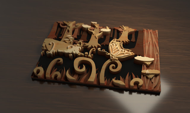
Week 4 - Project Render
The youtube tutorial on rendering in Rhino was very helpful for making renders of my project. I pretty much followed it step by step, choosing my own settings for the different tools to get a look I liked. The most importing thing I learned from the video was definitely how to set the render settings to high quality, because I had no clue why the rendering looked so pixilated at first.
I wanted to make a basic render of the piece as if it were sitting on a table, and another one showing what it might look like hanging from a wall. I didn't know how to represent the engraved areas in the render, so that was left out of the final images.
I started out by copying my 3D prototype into its own file so I could make my render without having to worry about all the cutter of the process in the same file. I set each layer of the piece to be on a different layer in Rhino so I could easily give them different materials (but in hindsight I just assigned materials to the objects rather than the layers so this didn't really matter).
I found the environment very hard to work with, it never looked good visible in the background so I just ended up covering up with the ground plane (or the wall plane). None of my materials were very reflective, and I did custom lighting with rectangular lights so the environment didn't end up effecting lighting or reflections much.
I set up the spaces based off of my own house, A simple dark, polished wood tabletop, and a plain beige painted wall that the piece was placed on. I used the rectangular light, and messed with the settings until it looked how I wanted.
I adjusted the camera using shift-left click to pan and shift-ctrl-left click to rotate (which I find far a more intuitive method of rotating than the normal left click is) to make the saved views for rendering.
For the render on the tabletop I also set up a custom focus to give it a better sense of depth.
I would have liked to have been able to render the piece in a more complicated space, for instance to make it look like its actually hanging on a wall in a room, if I knew how.


Comments
Post a Comment